Serious about quality | Using colours | What is font size?
Being serious about your quality management system
 In the bad old days, the ISO 9001 Quality Management Systems standard was poorly understood and very labour-intensive. There was a lot of paperwork. Consultants would set up documents in folders. Management would laboriously drag them out, sometimes just before audit time. Few people really understood.
These days, consciousness and technology have caught up and the standard has also evolved. Records are easier to keep, and procedures easier to publish electronically. I believe that ideas like risk, the process view, customer focus and continual improvement are more widely understood. In the new 2015 version of the standard, management has to consider context and stakeholders and decide what quality management is appropriate. It does not spell out specific documented procedures, so lazy managers can no longer buy them off the shelf and pretend that they are in use.
For most businesses ISO 9001 certification does take some effort and expense, but brings benefits. We only work with clients who are serious about benefiting from the ISO 9001 journey as well as getting the certification. Most of them are already at least half way there. The goal of being certified to the standard motivates them to introduce the practices that they know they should have had anyway.
We pledge to our clients that we’ll help them make sure everything they introduce for ISO 9001 will make sense and benefit their business. For more about our approach to certification, see ISO 9001 (and other standards)— 7 steps or contact us.
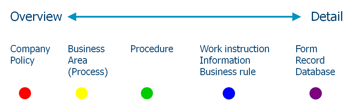
The universal colour sequence
A quiz question for you: What is the only internationally recognised colour sequence? The rainbow! How can we use this in information design? We can use it to illustrate a hierarchy or sequence.
For example, we can use it to indentify the document hierarchy levels in a procedure manual. Assign a rainbow colour to the level of each type of document. In our practice, we use red for the document type with the least detail, the policy or set of rules, and violet for the most detailed information level, the data collection form and the database.
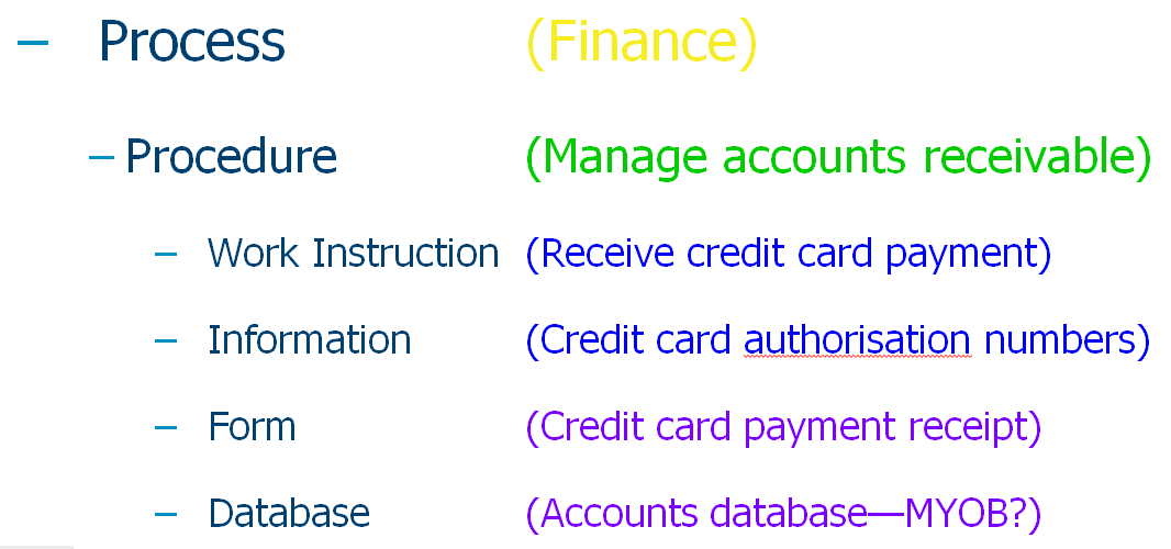
Here is an example of some topics from a procedure, showing the colour coding
Do you have an important concept for your team or your clients to understand and you have to get it right? To discuss using colour sequences to get the message across, please contact us.
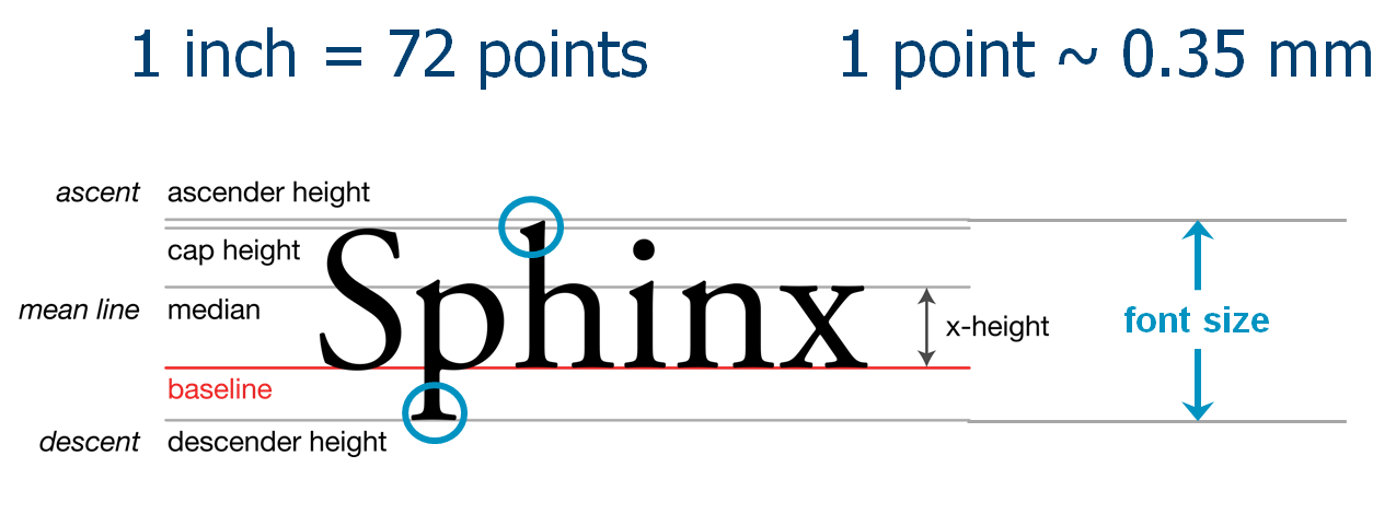
What is the point?
This is about the point, the unit of measure for font size. We talk about ’10 point’ or ’18 point’ type, but what exactly does this mean?
We measure font size as the distance between the bottom of the descender (for example, the bottom of the tail of a lower case ‘p’), and the top of the ascender (for example the top of a lower case ‘h’). The unit of measure is the point, which is 1/72 of an inch, or about 0.35 mm.
The world of fonts goes back a long way and these days is both and art and a science. For more information, start here in Wikipedia.